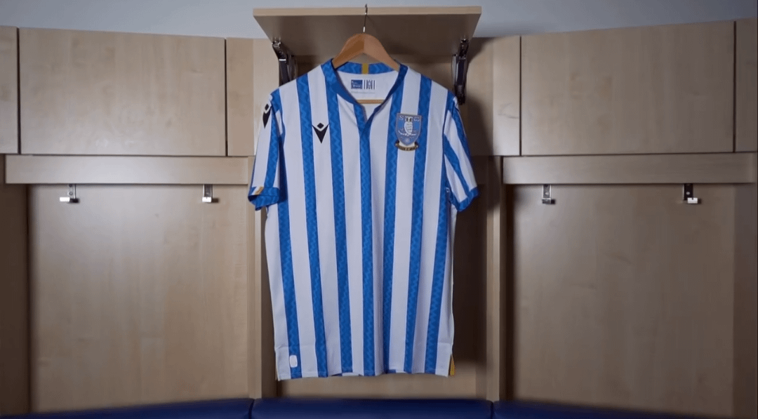
Nice. Like that’s it’s more white than blue. Something a bit different. Will be interesting to see the sponsor that we’ll inevitably get in September.
hotpinkflamingos on
It looks nice now because there is no sponsor plastered over it. The sponsor can ruin a shirt so for me it’s hard to have an opinion until I see it with the sponsor.
Dead_Namer on
Surely that’s not real? It looks like a knock off from Vietnam. Looks as bad as our Nike PL kits.
Wipedout89 on
The blue seems a touch light. It almost reminds me of a seaside deckchair or something. I don’t hate it but it’s not a classic
BuenasVibras on
Gives me real sociedad vibes, probably because it’s a blue and white striped Macron kit, I don’t hate it though just don’t want red numbers
earnshaw30 on
Not a huge fan prefer thicker stripes black shorts though so not terrible
Clarctos67 on
Glad we’ve returned to black shorts; it’s the bit that sets us apart from other blue and white striped shirts and should never be dropped.
Happy enough with the shirt…then saw it seems to have a huge white empty space on the back.
WarKaren on
I know im biased an all but… eurgh.
Edit: at least they actually have an announced kit. Ours won’t be announced until the 5th game of the season as per 🙄
True_Safe4056 on
At least you’ve binned that horrendous sponsor from last years shirt
On sale Monday so you can get it without a sponsor.
Hancri84 on
Bananas in pajamas comes to mind
OkraEmergency361 on
Black shorts -now that’s better!
I dunno, guess I’m used to the stripes being wider, but it’s nice enough. Any idea who the new sponsor will be yet?
Mulderre91 on
Lee Chapman scoring goals vibes.
Papa_Puppa on
It’s a kit, my dudes.
English_Joe on
£69 ?!?!
£69 !!!!
£69 ???
SteelCityCaesar on
Sorry but that’s a stinker. Stripes too thin. Shitty pattern in the stripes. Blue too pale. WTF is that collar? Even the shape of it, looks like a square.

19 Comments
There’s a joke that can’t be made but I think we all know what it is…
https://www.instagram.com/reel/C8j_2Y_NGzy/?igsh=dGV3MmhiN2djdmN0
Meh. It has stripes, and a middle one at that.
Nice. Like that’s it’s more white than blue. Something a bit different. Will be interesting to see the sponsor that we’ll inevitably get in September.
It looks nice now because there is no sponsor plastered over it. The sponsor can ruin a shirt so for me it’s hard to have an opinion until I see it with the sponsor.
Surely that’s not real? It looks like a knock off from Vietnam. Looks as bad as our Nike PL kits.
The blue seems a touch light. It almost reminds me of a seaside deckchair or something. I don’t hate it but it’s not a classic
Gives me real sociedad vibes, probably because it’s a blue and white striped Macron kit, I don’t hate it though just don’t want red numbers
Not a huge fan prefer thicker stripes black shorts though so not terrible
Glad we’ve returned to black shorts; it’s the bit that sets us apart from other blue and white striped shirts and should never be dropped.
Happy enough with the shirt…then saw it seems to have a huge white empty space on the back.
I know im biased an all but… eurgh.
Edit: at least they actually have an announced kit. Ours won’t be announced until the 5th game of the season as per 🙄
At least you’ve binned that horrendous sponsor from last years shirt
https://www.swfc.co.uk/news/2024/june/202425-official-macron-home-kits-on-sale-monday/
On sale Monday so you can get it without a sponsor.
Bananas in pajamas comes to mind
Black shorts -now that’s better!
I dunno, guess I’m used to the stripes being wider, but it’s nice enough. Any idea who the new sponsor will be yet?
Lee Chapman scoring goals vibes.
It’s a kit, my dudes.
£69 ?!?!
£69 !!!!
£69 ???
Sorry but that’s a stinker. Stripes too thin. Shitty pattern in the stripes. Blue too pale. WTF is that collar? Even the shape of it, looks like a square.
Well done Macron, you’ve done it again.