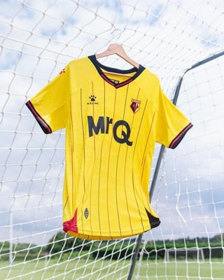
ReawulWalrus on June 28, 2024 8:20 am Spectacular. Strange how they haven’t released the shorts and socks yet, we all know that they’re red.
BuenasVibras on June 28, 2024 8:26 am This looks like a classic Watford kit, big fan of it and one of the better ones this season
shifty18 on June 28, 2024 9:00 am And you can order it without the sponsor! [With and without](https://www.thehornetsshop.co.uk/kit/home-kit/?utm_source=Club+Site&utm_medium=Article+Link&utm_campaign=24%2F25+Home+Kit+Launch)
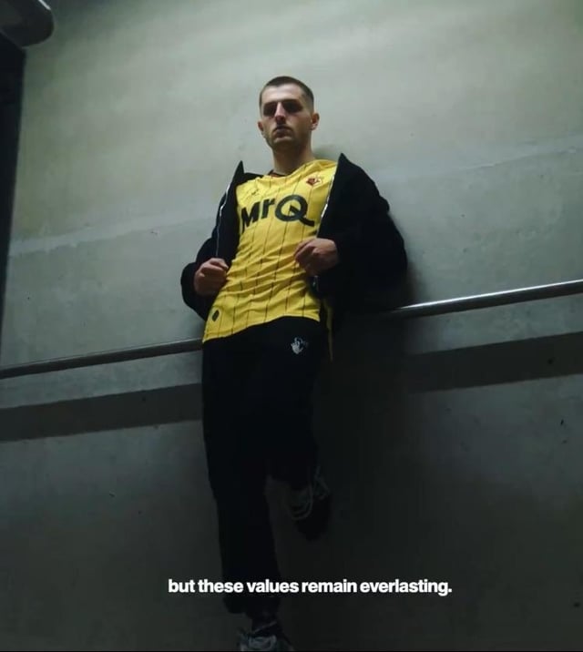
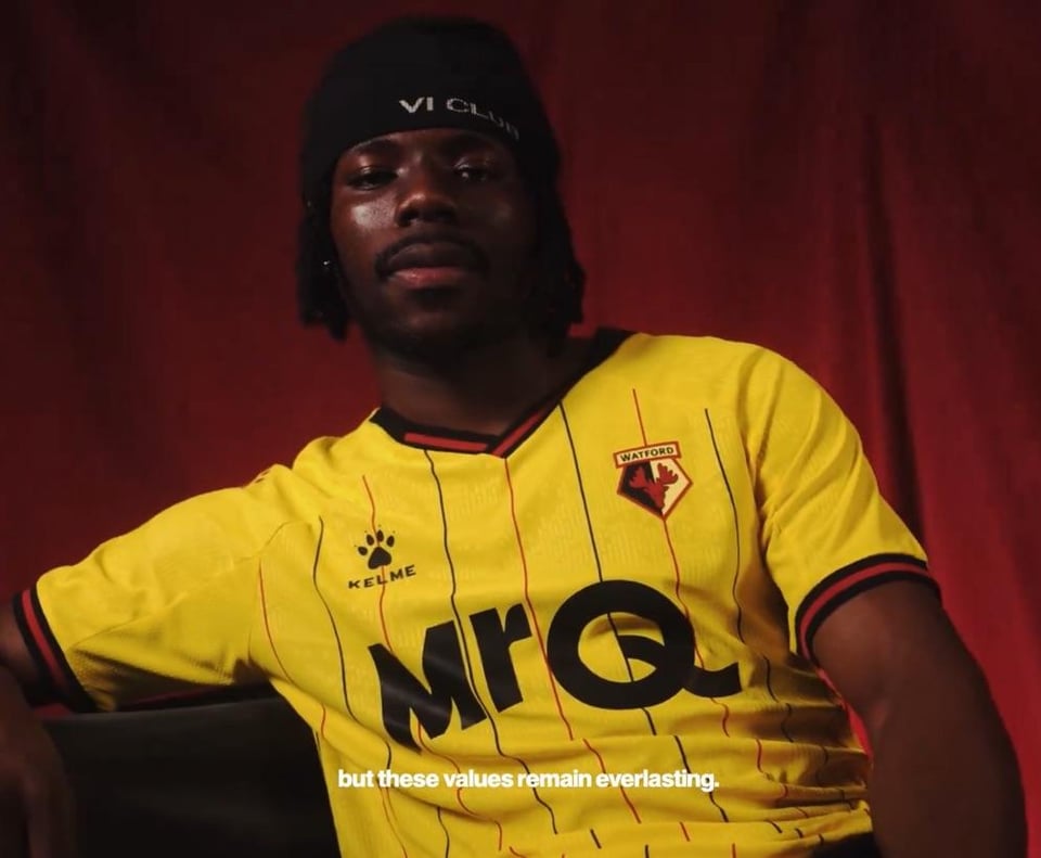
cmdrxander on June 28, 2024 9:23 am I was thinking “oh cool, a non-gambling sponsor!”, until I looked up what it actually was
Sykryk on June 28, 2024 9:32 am I’m still a huge fan of the controversial 2020-21 home kit (the first one by Kelme).
Dead_Namer on June 28, 2024 9:44 am Reminds me of an old pub team kit, pin stripes do that to me for some reason. Nothing terrible about it apart from the sponsor.
BowiesFixedPupil on June 28, 2024 9:48 am Great shirt, tacky sponsor. That should probably be the Championship motto, either that or shit shirt tacky sponsor but this one is decent imo.
cloughie on June 28, 2024 9:50 am I liked it when they had dog coin on the sleeve, the moose in their crest, the hornet on the back of the neck and the Kelme paw on the chest
thewrongnotes on June 28, 2024 10:03 am Seems like I’m in the minority here, but these retro type kits don’t do it for me. Give me a design that is modern and reflects the age we’re in, I don’t need a shirt trying to be something from 40 years ago.
Slothehhh on June 28, 2024 10:39 am Get rid of the Kelme and Mr Q logos, and you’ve got yourself an incredible looking shirt
Yack10 on June 28, 2024 11:33 am Annoyingly nice… apart from the sponsor. Are the red shorts coming back any time soon?
YourCreepyGramps on June 28, 2024 11:45 am That is a nice kit… To get battered in! (They’ve beaten us at home the past 2 times we’ve played there)
marstonspedigree on June 28, 2024 12:31 pm Pinstripes are always a winner! Wish we (Derby) has done something similar.

29 Comments
Spectacular. Strange how they haven’t released the shorts and socks yet, we all know that they’re red.
This looks like a classic Watford kit, big fan of it and one of the better ones this season
Lovely stuff
Ew
90’s vibes off it looks lovely
Ooooh, that is nice
And you can order it without the sponsor!
[With and without](https://www.thehornetsshop.co.uk/kit/home-kit/?utm_source=Club+Site&utm_medium=Article+Link&utm_campaign=24%2F25+Home+Kit+Launch)
Simple, clean and slightly retro looking. Love it.
Damn, those pin stripes look real nice
Old school i like it. Our new home ( North End ) looks awful
I was thinking “oh cool, a non-gambling sponsor!”, until I looked up what it actually was
I’m still a huge fan of the controversial 2020-21 home kit (the first one by Kelme).
Proper Watford shirt, 10/10!
Reminds me of an old pub team kit, pin stripes do that to me for some reason. Nothing terrible about it apart from the sponsor.
Great shirt, tacky sponsor.
That should probably be the Championship motto, either that or shit shirt tacky sponsor but this one is decent imo.
I liked it when they had dog coin on the sleeve, the moose in their crest, the hornet on the back of the neck and the Kelme paw on the chest
Seems like I’m in the minority here, but these retro type kits don’t do it for me.
Give me a design that is modern and reflects the age we’re in, I don’t need a shirt trying to be something from 40 years ago.
For once a Watford kit looks nice
Get rid of the Kelme and Mr Q logos, and you’ve got yourself an incredible looking shirt
Love a pinstripe, me.
Nice smart shirt that… is Mr Q a gambling company??
Very similar to Oxford’s home shirt
That’s decent tbf
Annoyingly nice… apart from the sponsor. Are the red shorts coming back any time soon?
That is a nice kit…
To get battered in! (They’ve beaten us at home the past 2 times we’ve played there)
Decent!
A decent Watford kit in a long while
Pinstripes are always a winner! Wish we (Derby) has done something similar.
If only it had a collar, it would be perfect