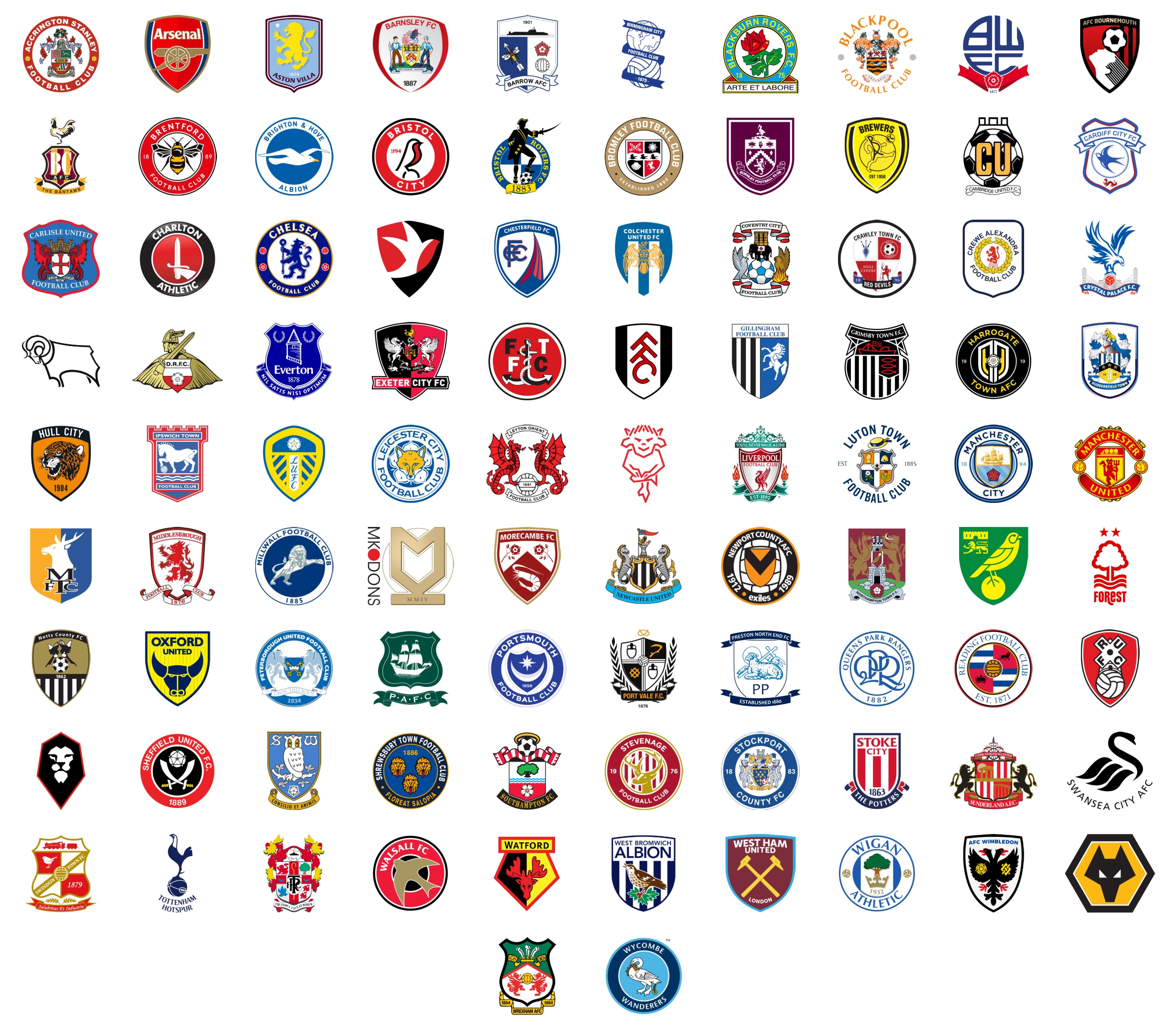
Something about the Cambridge United badge really doesn’t do it for me. The lettering/font looks quite amateur-ish
Gulag-Shower on
Blackburn’s a classic
AngryTudor1 on
I love Forest, Derby, Lincoln badges for their simplicity
NeverGonnaGiveMewUp on
Any badge with a bird on is fine by me. Except Brighton. Of all the animals to choose, a sodding seagull.
DetectiveMundane8556 on
Just looking at Northamptons badge gives me depression
Ok-Construction-7210 on
Big fan of Oxford’s crest
Plastic-Alfalfa-6321 on
best blackburn birmingham ipswich
worst fleetwood burton mk dons
Super_Bright on
Always found Brums badge a bit strange. I’m sure there’s a reason for a globe and a ball but doesn’t feel very “Birmingham” to me. Like I guess the idea is Birmingham is a world city but that’s true of most large cities.
In contrast, I’ve always loved Bristol Rovers badge. Like, it looks like a bottle of Captain Morgan, sure. but there’s not much more Bristol than their history of piracy. They don’t hold back either. Modern design convention may suggest it’s better to stick to simple shapes and colours but they just said nah, fuck it. Massive fucking Pirate. Genuinely class.
sinisterRF on
Cheltenham Town have the ugliest, but their old one is beautiful. Modernisation at its worst, along the lines of Arsenal.
AlanBeswicksPhone on
Preston’s has always looked very clean
Ok_Music253 on
If we still had the Flavio Briatore hair badge then QPR by a long shot, but I love the simplicity of the modern badge, although it’s not quite as good IMO as it was pre-Flavio hair (probably an age thing though).
I’ve always quite liked Blackburn’s though.
Krakshotz on
Man City’s and Boro’s previous badges are better than their current ones
Jjez95 on
Sheffield wednesday’s is great, the older was slightly better tho, in general owls are class.
Bolton is underrated imo stands out, looks pretty elegant and cool tbh
Have a soft spot for bristol city’s, robins are class too
Current arsenal
badge is the biggest downgrade and has aged horribly imo bring back the fancy fonts or art deco vibes preferably both if possible
Also salford’s is shit, looks like a logo for a laser quest arena
yorkshirenation on
Even with a red rose, I have to admit Blackburn’s is a thing of beauty. Soft spot for QPR for simplicity. Hate to admit I like Wednesdays’s too, but I really like the aesthetic. Ipswich nice and unique. Ours isn’t my favourite by any stretch.
Joshgg13 on
I love AFC Wimbledon’s badge (nothing to do with them being a phoenix club or anything, it’s just a lovely badge). Cambridge desperately need a new badge and Lincoln’s is a bit creepy, even though I respect the uniqueness of it
TescosTigerLoaf on
Bournemouth is lit, looks like soviet propaganda. I find a lot of the really old fashioned ones too busy.
Mikko85 on
Blackburn, Charlton, Reading, West Ham, Wolves, WBA, Mansfield. I’ve always liked those ones. Just because maybe colours, overall cleanness/distinctiveness, uniqueness.
I also really liked the old Portsmouth badge, less so the newer one although it’s still not bad. If I was answering this based on the badges ten years ago it’d probably be different.
Constant-Estate3065 on
I quite like Reading’s badge, it’s smart and classy. Port Vale’s I always think looks a bit like Alan Partridge’s blazer badge, which is awesome. MK is genuinely an ugly badge, and it’s MK so…
CBY5 on
Barrow with the Bee + Arrow gets bonus points for been pretty funny
jbkb1972 on
No one has said our badge is the worst, maybe people do like us after all.
stereoworld on
I love Derbys, Forests and Palaces. Also loved Morecambes shrimp until they added all that nonsense around it
Worst one is probably Northampton. With the maroon, it reminds me of some old pub signage that hasn’t been refurbished in 30 years.
wizard_w1 on
Can’t stand our badge looks far too corporate and generic. Always like the gas’, Preston and Palace
nimzoid on
I like Forest and Derby’s old school cool. Bournemouth is slick. Spurs is classy.
I don’t like Cambridge, Hull feels too American sports and MK Dons feels like they said ‘No one likes us anyway, so why try harder with the badge?’.
FiestaForSale on
I’ve always admired the Sunderland badge. For a logo that has so much “going on” it still doesn’t look over the top nor outdated, and in an era where minimalist designs is all the wave it stands out in the best possible way. For worst I’d go with Leeds. In part because it’s simply an ugly badge, but mainly because it’s an insult to how good it could be if they just went back to their roots
combat_lobotomy on
Is the Lincoln City badge having a wank?
OrangeSodaMoustache on
The East Midlands kills it with their badges. Derby, Forest and Lincoln are all bangers, Leicester, Burton and Mansfield have decent badges too. Notts County’s is a bit drab looking but it’s classic.
eddsaysftw on
Best:
Notts County
Blackburn Rovers
AFC Wimbledon
Sunderland
Millwall
Lincoln
Preston North End

28 Comments
Fuck MK Dons
Something about the Cambridge United badge really doesn’t do it for me. The lettering/font looks quite amateur-ish
Blackburn’s a classic
I love Forest, Derby, Lincoln badges for their simplicity
Any badge with a bird on is fine by me. Except Brighton. Of all the animals to choose, a sodding seagull.
Just looking at Northamptons badge gives me depression
Big fan of Oxford’s crest
best blackburn birmingham ipswich
worst fleetwood burton mk dons
Always found Brums badge a bit strange. I’m sure there’s a reason for a globe and a ball but doesn’t feel very “Birmingham” to me. Like I guess the idea is Birmingham is a world city but that’s true of most large cities.
In contrast, I’ve always loved Bristol Rovers badge. Like, it looks like a bottle of Captain Morgan, sure. but there’s not much more Bristol than their history of piracy. They don’t hold back either. Modern design convention may suggest it’s better to stick to simple shapes and colours but they just said nah, fuck it. Massive fucking Pirate. Genuinely class.
Cheltenham Town have the ugliest, but their old one is beautiful. Modernisation at its worst, along the lines of Arsenal.
Preston’s has always looked very clean
If we still had the Flavio Briatore hair badge then QPR by a long shot, but I love the simplicity of the modern badge, although it’s not quite as good IMO as it was pre-Flavio hair (probably an age thing though).
I’ve always quite liked Blackburn’s though.
Man City’s and Boro’s previous badges are better than their current ones
Sheffield wednesday’s is great, the older was slightly better tho, in general owls are class.
Bolton is underrated imo stands out, looks pretty elegant and cool tbh
Have a soft spot for bristol city’s, robins are class too
Current arsenal
badge is the biggest downgrade and has aged horribly imo bring back the fancy fonts or art deco vibes preferably both if possible
Also salford’s is shit, looks like a logo for a laser quest arena
Even with a red rose, I have to admit Blackburn’s is a thing of beauty. Soft spot for QPR for simplicity. Hate to admit I like Wednesdays’s too, but I really like the aesthetic. Ipswich nice and unique. Ours isn’t my favourite by any stretch.
I love AFC Wimbledon’s badge (nothing to do with them being a phoenix club or anything, it’s just a lovely badge). Cambridge desperately need a new badge and Lincoln’s is a bit creepy, even though I respect the uniqueness of it
Bournemouth is lit, looks like soviet propaganda. I find a lot of the really old fashioned ones too busy.
Blackburn, Charlton, Reading, West Ham, Wolves, WBA, Mansfield. I’ve always liked those ones. Just because maybe colours, overall cleanness/distinctiveness, uniqueness.
I also really liked the old Portsmouth badge, less so the newer one although it’s still not bad. If I was answering this based on the badges ten years ago it’d probably be different.
I quite like Reading’s badge, it’s smart and classy. Port Vale’s I always think looks a bit like Alan Partridge’s blazer badge, which is awesome. MK is genuinely an ugly badge, and it’s MK so…
Barrow with the Bee + Arrow gets bonus points for been pretty funny
No one has said our badge is the worst, maybe people do like us after all.
I love Derbys, Forests and Palaces. Also loved Morecambes shrimp until they added all that nonsense around it
Worst one is probably Northampton. With the maroon, it reminds me of some old pub signage that hasn’t been refurbished in 30 years.
Can’t stand our badge looks far too corporate and generic. Always like the gas’, Preston and Palace
I like Forest and Derby’s old school cool. Bournemouth is slick. Spurs is classy.
I don’t like Cambridge, Hull feels too American sports and MK Dons feels like they said ‘No one likes us anyway, so why try harder with the badge?’.
I’ve always admired the Sunderland badge. For a logo that has so much “going on” it still doesn’t look over the top nor outdated, and in an era where minimalist designs is all the wave it stands out in the best possible way. For worst I’d go with Leeds. In part because it’s simply an ugly badge, but mainly because it’s an insult to how good it could be if they just went back to their roots
Is the Lincoln City badge having a wank?
The East Midlands kills it with their badges. Derby, Forest and Lincoln are all bangers, Leicester, Burton and Mansfield have decent badges too. Notts County’s is a bit drab looking but it’s classic.
Best:
Notts County
Blackburn Rovers
AFC Wimbledon
Sunderland
Millwall
Lincoln
Preston North End
Worst:
Cambridge
Newport Co
Cheltenham
MK Dons